
Vancouver Exposed
Eve Lazarus
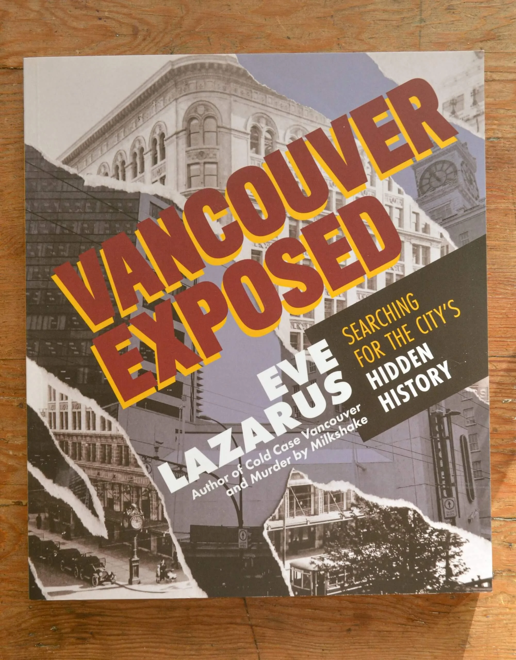
The cover of Vancouver Exposed is a great mix of archival photograph from the 1920’s of Granville and W. Georgia streets and the site’s current evolution. The torn effect hints at the destruction of our past, but it also depicts the importance of revealing of our hidden history that happens within the covers of this book. It marks the way in which we often do not protect our heritage and begs the reader to notice it and confront the history that was lost. The type and layout of the interior needed to convey a sense of newsworthiness.
The heading typography was chosen to mimic “BREAKING NEWS” headlines in newspapers and the body font was also inspired by readable fonts that were created in the 90’s for newspaper use to fit comfortably in narrow columns and read well in small sizes. To ensure the type still feels fresh today, we used a mix of the wide and narrow variations of the type family within the headlines to create a contemporary, unique look. Vancouver Exposed was a finalist for the 2021 Bill Duthie Bookseller’s Choice Award.